
Black and White Photography vs. Colour
Black and white photography is where it all began – and yet, it is far from outdated. Even with all the spectacular, vibrant, accurate and real-life representations that are possible with full-colour photography, there are few photographers who would categorically assert that colour is more desirable. I certainly don’t think so. Rather, I have a different purpose in mind when I choose to shoot in black and white over colour. While in good light colour can be the perfect medium for communicating a particular mood, time, season, or setting, black and white photography is all about raw textures and contrast.

Contrasts, Mid-tones, Power and Complexity
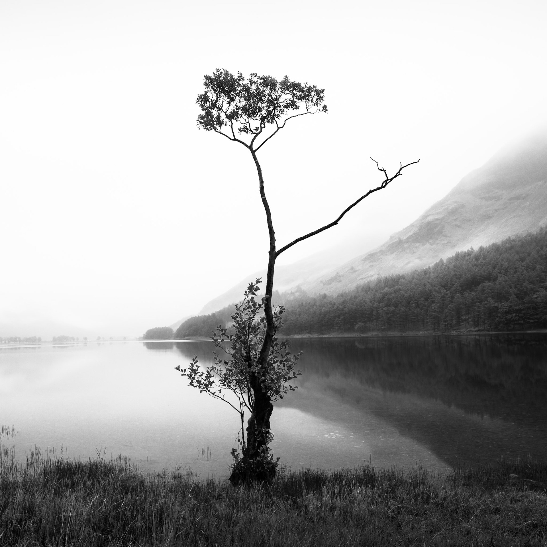
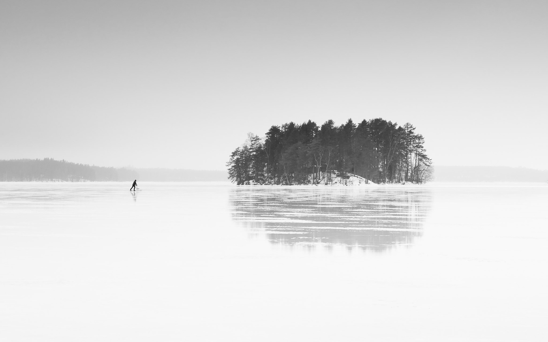
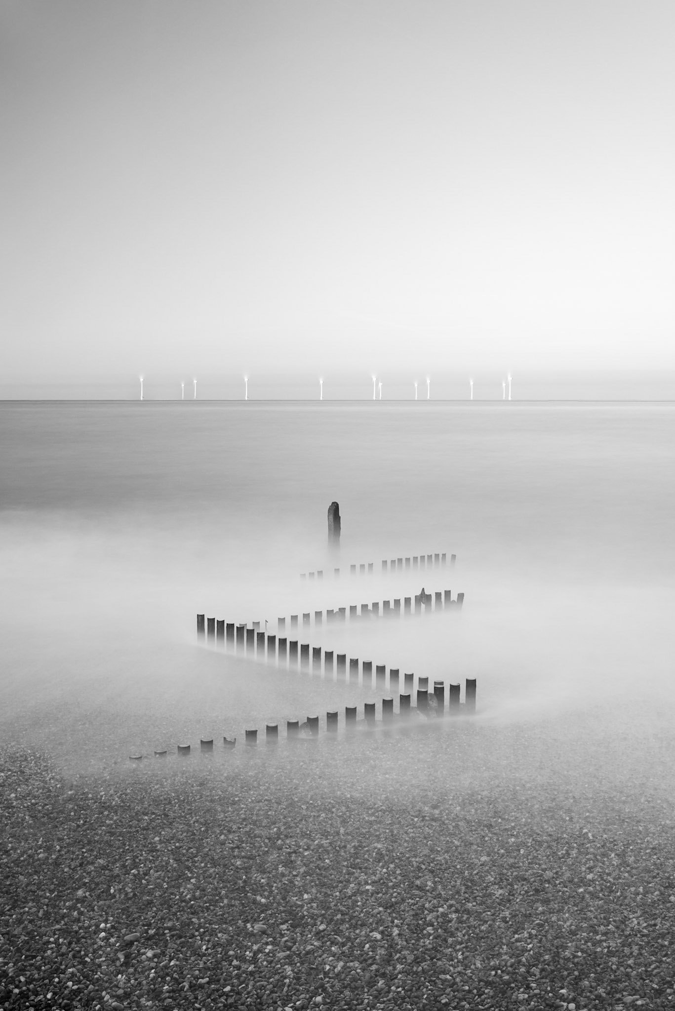
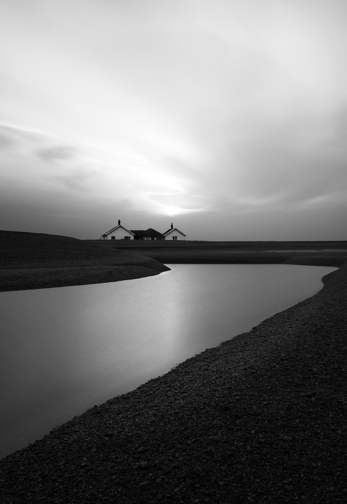
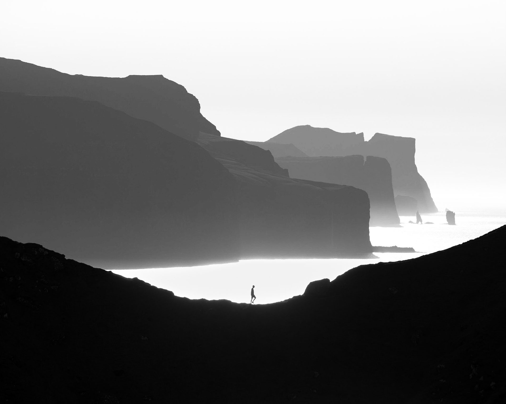
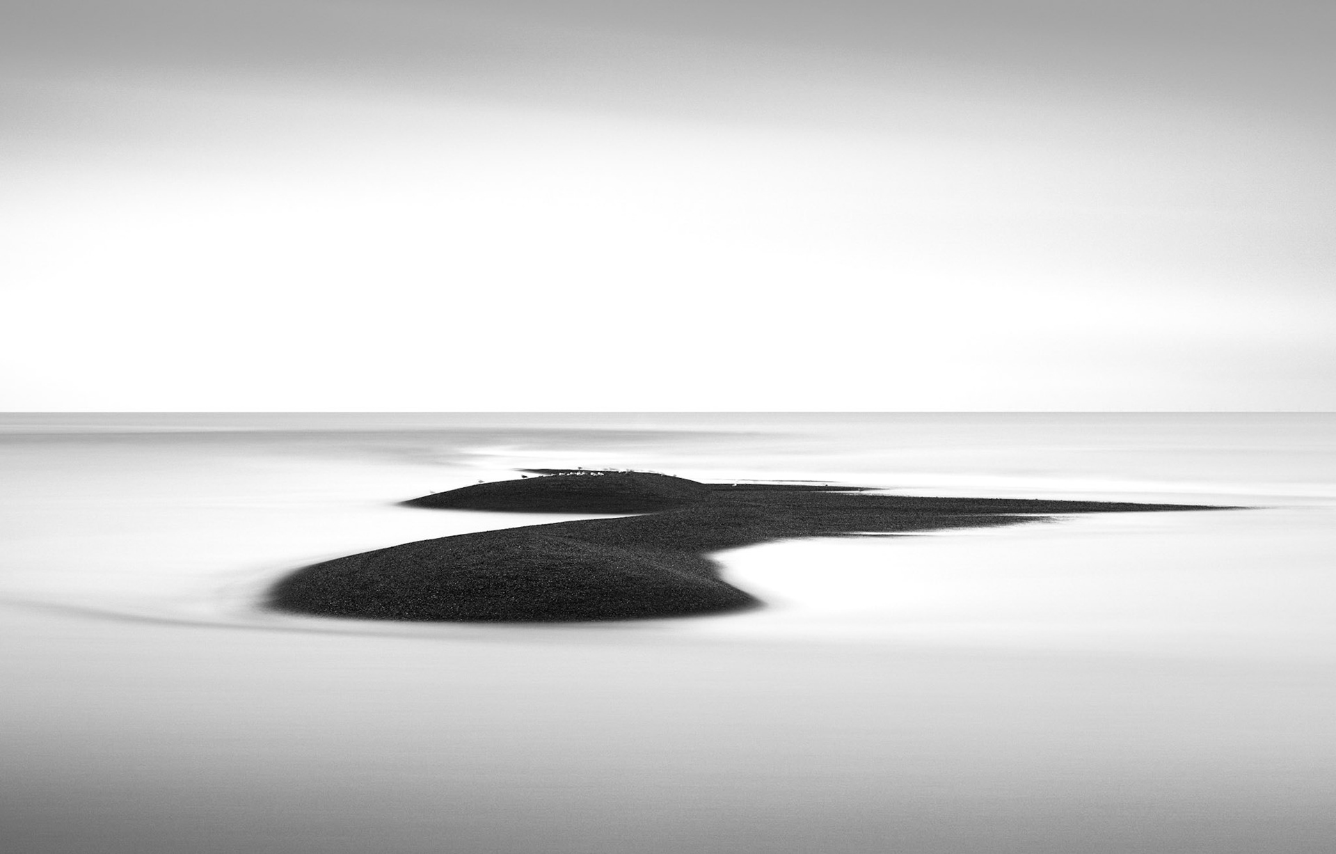
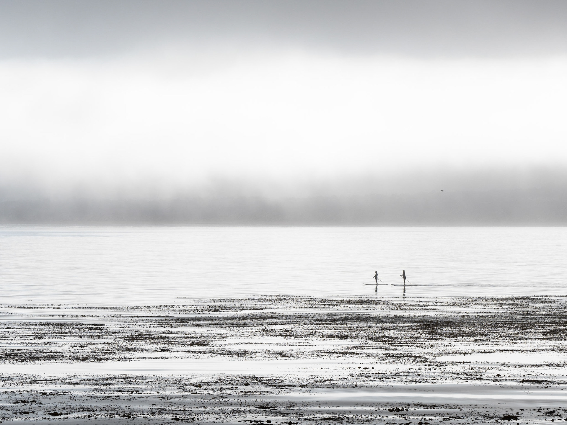
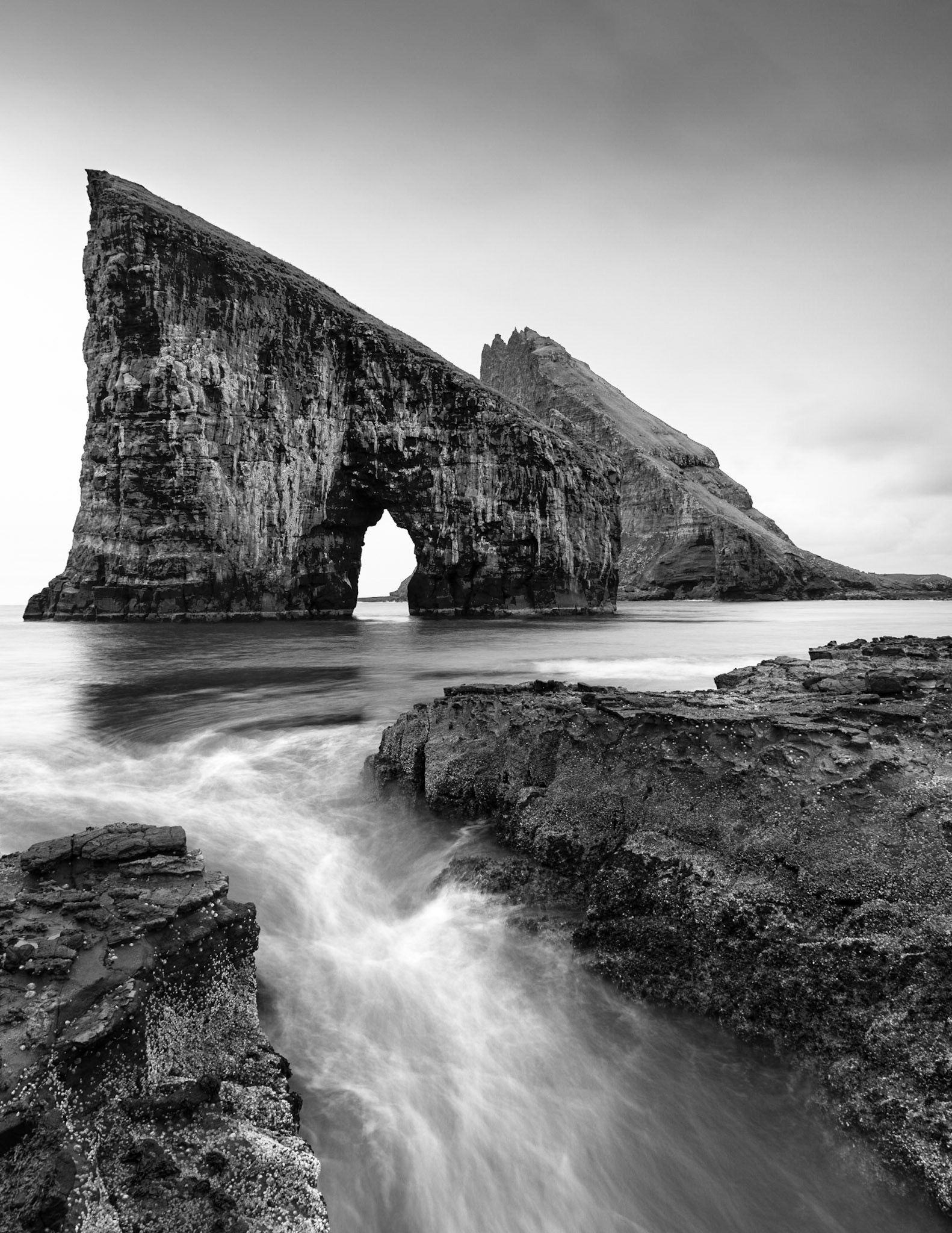
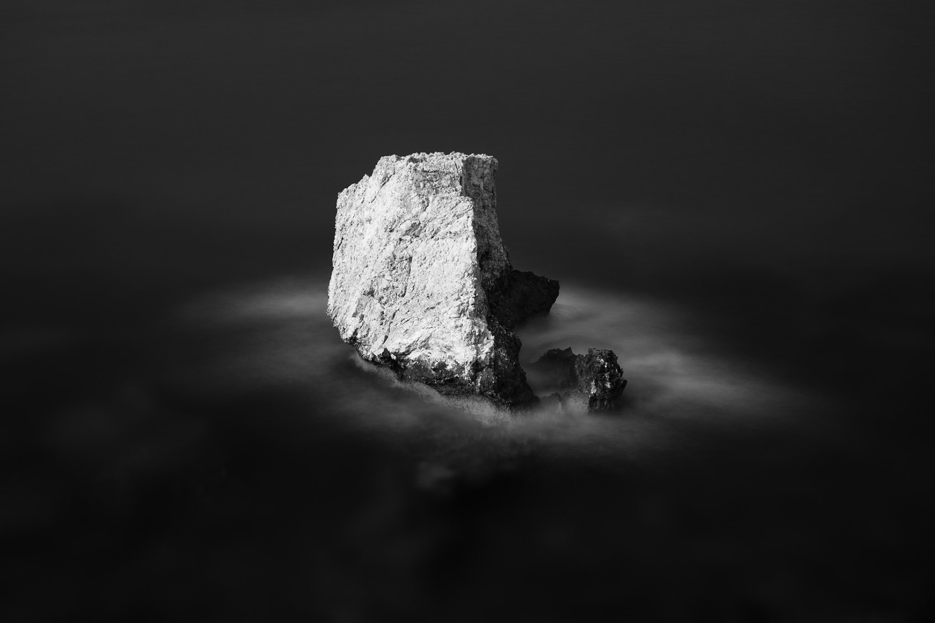
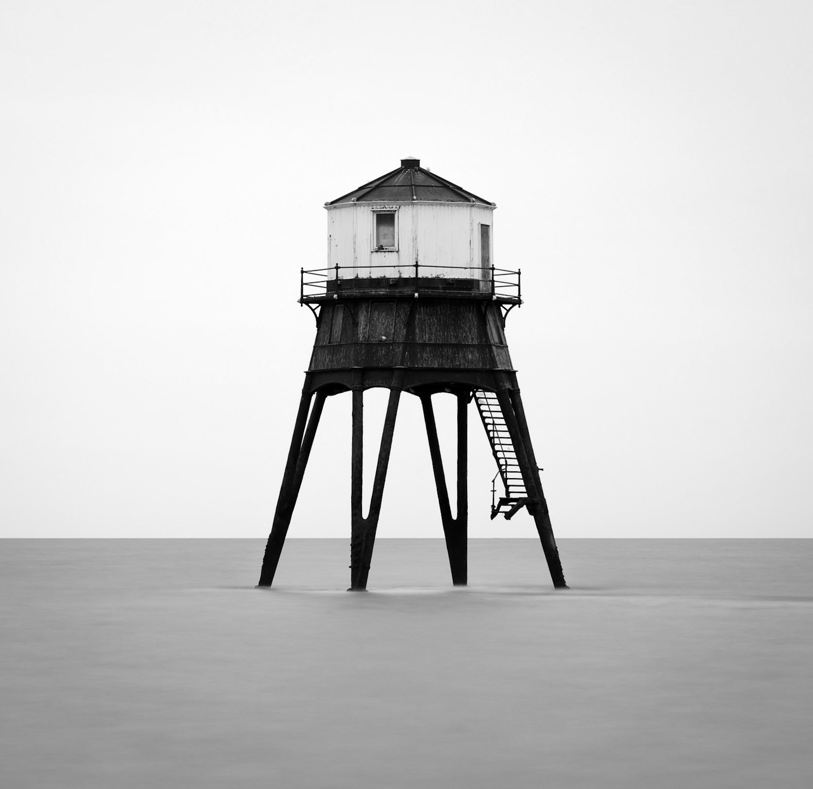
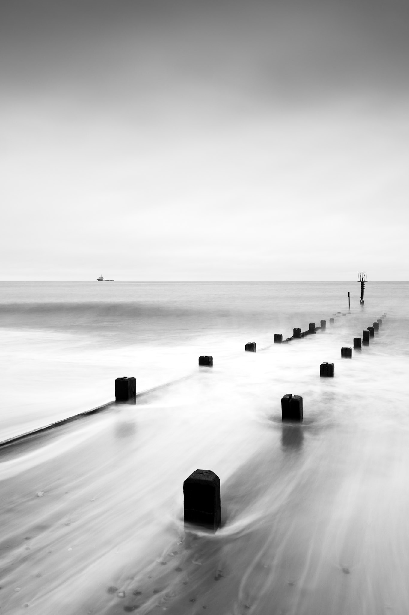
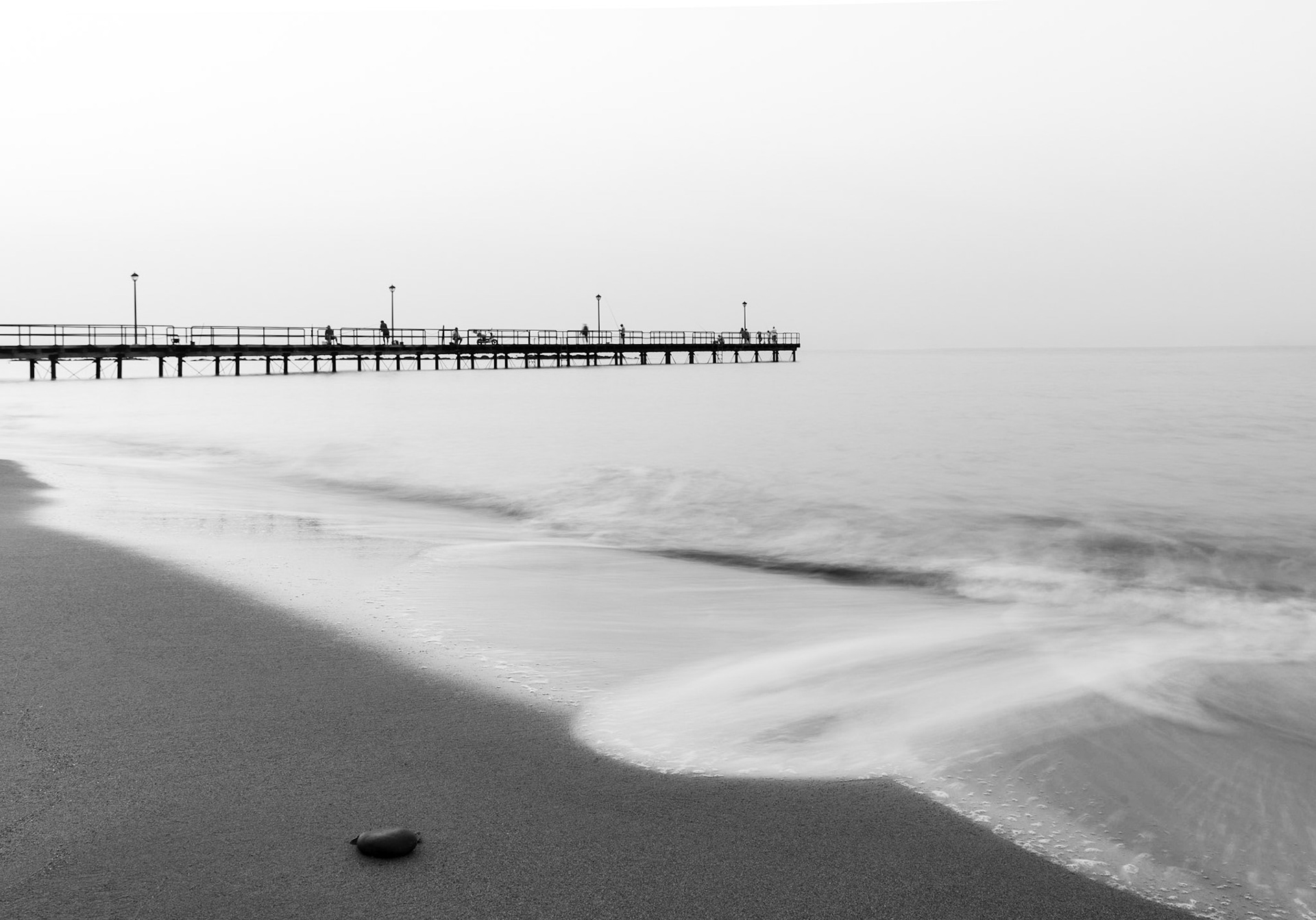
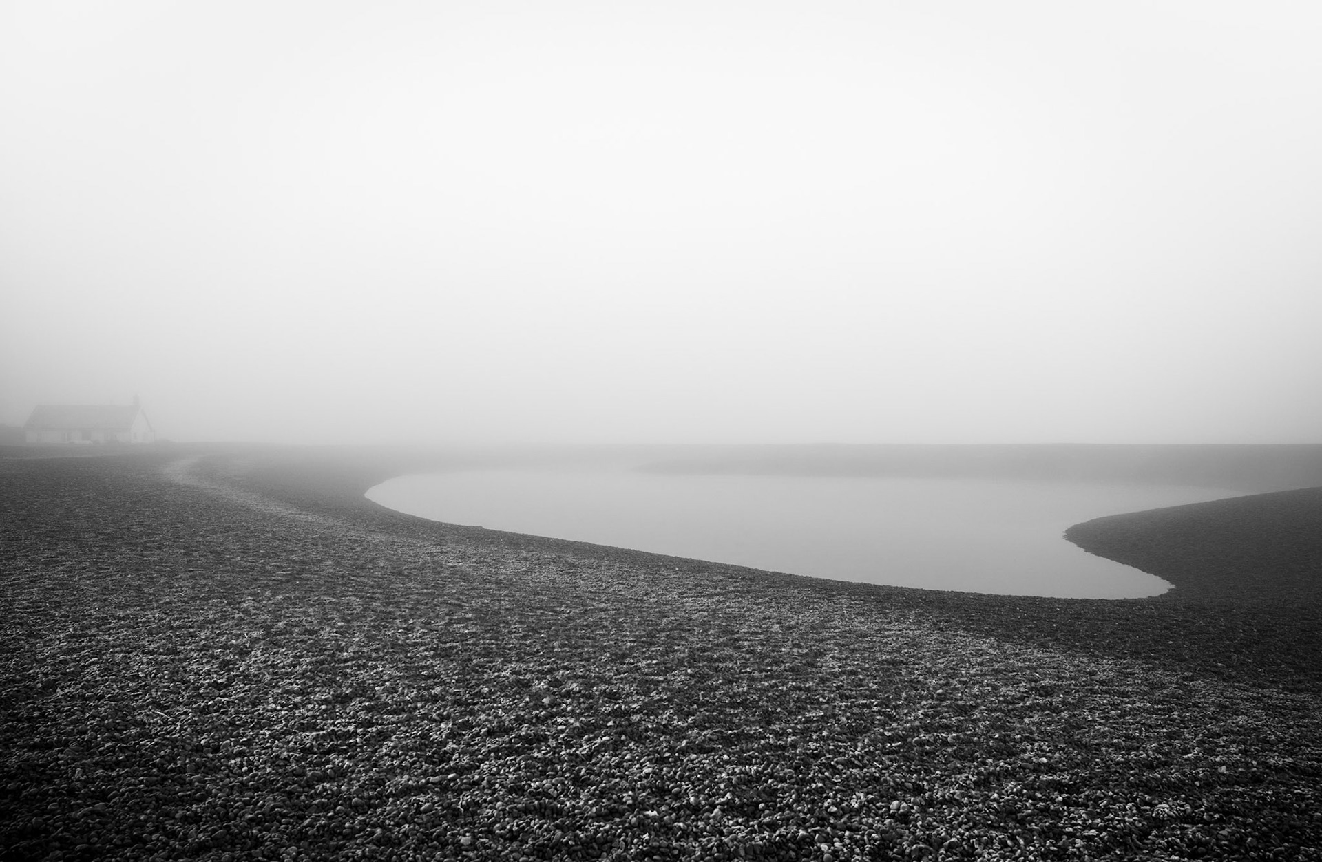
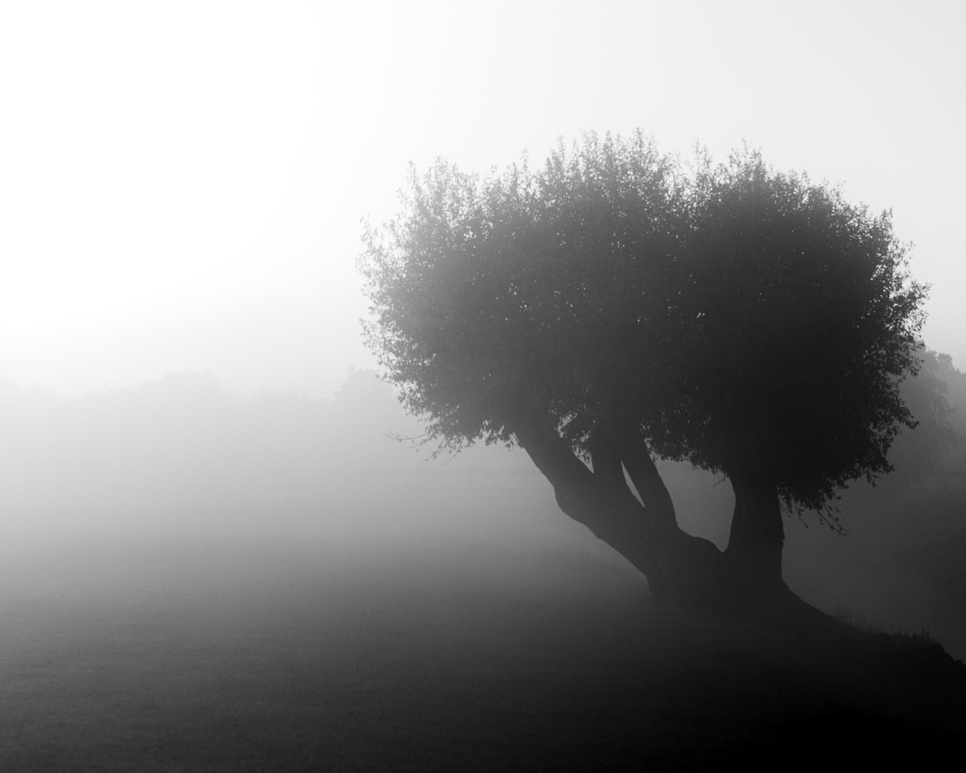
The lack of colour in a black and white photograph accentuates both the light and dark portions of the final piece – and, more importantly, the disparity between them. Shadows are more impactful, while backlit subjects stand out as silhouettes against the light. The removal of colour also helps the viewer to focus. We see the world in colour – so when we are presented with a monochrome image, it makes us pause and look more closely. But black and white photography can also be soft, gentle, or subtle. Black and white beach photos, for example, often have just few silver-grey mid-tones. And it’s this unimposing subtlety that makes them so deceptively complex and powerful. There is such a huge variety of what can be achieved with black and white photography – and so many tones in between that I relish in drawing out.